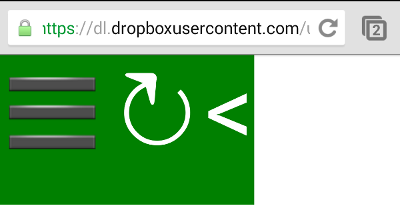
 While experimenting with the use of Unicode characters in a small proof of concept, I stumbled upon what I think is a bug in Chrome for Android. Apparently character ☰, which renders as ☰ and which most people consider the “options”-icon, cannot be given a color in Chrome for Android whereas other Unicode characters can.
As you can see when visiting this test-page, the 3 symbols styled correctly (font color white) in most browsers (tested on IE8, FF on W7, Ubuntu and Android, Chrome on W7 and Ubuntu), but the options-symbol is not white on Chrome for Android (at least on my Samsung Galaxy S4).
So, does this qualify as a bug, or did I just mess up? Anyone happens to know a workaround?
css
Should you inline or defer blocking CSS?
 You care about web performance and so you dutifully aggregate and minify your CSS. But then a couple of months ago Google PageSpeed Insights (for mobile) started identifying CSS as a render blocking resource and so you wonder if you should you inline your CSS, or even defer loading it. Based on tests executed on a multi-site WordPress installation, deferring CSS is not the best idea just yet, but inlining might be worthwhile! Read on for the hard numbers and other details.
The test-setup
- 4 test-blogs on a multi-site WordPress instance
- using the Expound theme (which is interesting because its main stylesheet imports 2 other CSS-files)
- using Lite Cache for page caching (new WordPress page caching plugin by the Hyper Cache author)
- the same content was imported on all 4 blogs
- all 4 had Autoptimize HTML & JS optimization active
- the difference was in the Autoptimize CSS settings, where:
- blog 1 had no CSS optimization at all (baseline )
- blog 2 had standard CSS aggregation and minification, linked in head
- blog 3 inlined the optimized CSS
- blog 4 deferred the optimized CSS
- each blog was tested on webpagetest.org‘s Amsterdam node on a DSL-profile using IE9 and doing 9 test-runs on one specific blogpost with contained a 16KBimage (I excluded favicon.ico as it seemed to pollute results)
- each blog was analyzed by Google PageSpeed Insights for both mobile & desktop
The results
| test report url | first byte | start render | doc complete | fully loaded | mobile pagespeed | desktop pagespeed | |
| 1. no css optimization | 140212_Z1_MKN | 0.299s | 2.246s | 2.221s | 2.221s | 79 | 92 |
| 2. optimized CSS linked | 140212_H7_MKP | 0.239s | 0.608s | 1.390s | 1.390s | 91 | 97 |
| 3. optimized CSS inlined | 140212_A3_NJA | 0.232s | 0.348s | 0.658s | 0.658s | 99 | 99 |
| 4. optimized CSS deferred | 140212_8J_P1G | 0.248s | 0.357s | 1.034s | 1.034s | 99 | 95 |
The conclusions
Based on these tests (your mileage may vary, always test your results):
- deferring all CSS is useless, performance is worse, desktop PageSpeed score is (slightly) lower and there is a “flash of unstyled content” between the rendering of the page and the application of the CSS.
- Inlining CSS yields the best results both from a page speed and PageSpeed perspective. Although the base HTML is larger as it has the CSS payload, this has almost no impact in this specific context and rendering is almost instantaneous. Off course in a context where multiple other pages from the same site, with the exact same CSS would be loaded, the impact would be significant. Hence inlining CSS is especially interesting for sites with a low pageviews/ visitor ratio.
The future; inline + defer
Deferring CSS may seem pretty useless, but the sweet spot may just be inlining base CSS (everything needed for initial rendering above the fold) and deferring everything else. This is what CSS optimizing tools should focus on in 2014 and you can certainly expect something along these lines in one of the next major Autoptimize releases (although diehards can already test this approach).
3 stylesheets to rule them all?
 Ik schreef eerder al dat ik me voor mijn nieuwe blogthuis (het duurt allemaal wat langer, maar het is dan ook goed toeven op wordpress.com) op het WordPress theme Indigo het gesmeten. Wat me verwondert bij het bekijken van zowat alle WP-themes (en zelfs veel web-software tout court), is het ontbreken van css voor print- en handheld-versies.
Het principe is nochtans eenvoudig; je definieert in je html welke css voor de media “screen” (de default voor gewone browsers), “print” en “handheld” gebruikt moeten worden en de browser kiest dan naargelang de context de juiste css. Makkelijk zat, toch? En toch lijkt bijna geen enkel WordPress-theme dit te doen. Meer nog, je hebt WordPress-plugins om voor een print– en pda-vriendelijke versie te zorgen. Plugins! PHP! CPU en memory-vretende code! Voor iets wat in bloody css kan!?! Maar panikeer niet lieve vriendjes, ik ben er dus mee bezig!
Aangezien print- en handheld-versies in CSS enerzijds makkelijk te bouwen zijn, maar omdat dat anderzijds zo weinig gebruikt lijkt te worden, is mijn vraag van de week: zijn er dan toch fundamentele problemen met het gebruik van print- en handheld-css? Waarom gebruikt gij geen print- en handheld-css? Uw professionele input wordt, zoals steeds, ten zeerste geapprecieerd!