What does a webtech addict do when in a Tesla?

Tesla Model S infotainment panelWell, checking out the browser, off course!
I had the opportunity to ride along with a friend in his brand new Tesla yesterday. Great ride, but you know that already, so I checked out the browser and data connectivity obviously. I visited my own little “ip check” page and saw this in the logfile:

188.207.103.140 – – [05/Feb/2015:12:17:24 +0100] “GET /check_ip.php HTTP/1.1” 200 132 “-” “Mozilla/5.0 (X11; Linux) AppleWebKit/534.34 (KHTML, like Gecko) QtCarBrowser Safari/534.34”

Breaking it down:

  • The free mobile data connectivity is provided by KPN (Base) in Belgium (and Holland, probably).
  • As per the useragent the car display runs on Linux (that little OS that could is really everywhere these days)
  • The browser is QtCarBrowser, which would obviously be built with QT and WebKit. Based on the WebKit version, one can deduct that the version of QT uses is 4.8. As such, QTCarBrowser seems very similar to QTWeb and might indeed be based on it. HTML5test.com rates QTWeb with 204/555, but Tesla’s QTCarBrowser result might still be different off couse.
  • The WebKit-version, 534.34, is pretty old and as such dates from mid 2011 (QT 4.8 was released in December 2011). This is close to the version that was used in Safari 5.1 (534.48.3).

I sure hope there are not too many vulnerabilities in those old version of of QT and WebKit, but one does not drive a Tesla to browse the internet, does one? 😉
Is the web too fat for your IPhone?

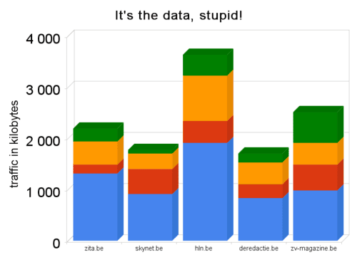
So you have a spiffy mobile phone with a top notch browser that does a decent job at displaying “desktop-oriented” websites and you use it to surf the web regularly, visiting some of the bigger news-sites in Belgium. What does that mean, from the point of view of data transfer and bandwidth usage?

data usage for 4 pages on 5 sites (click on image for more, methodology see below)

That sure is a lot of data, Captain! What does that mean?

  1. You will have to be patient, because downloading 1 or 2 Mb for that initial page will probably be gruesomely slow (especially if you’re on EDGE because there’s no 3G-coverage)
  2. You will end up paying good money for all that data transfer, because data is money when you’re on mobile time
  3. You might even curse your handset or crashing browser (more on google), because all that data will end up in RAM and these devices do not come with tons of that.

In these broadband-times, website builders seem to have completely forgotten about best practices for download size of complete web pages (html + all js/css/images/…). This means that a lot of websites should be considered non-accessible on mobile devices.
If you want your normal website to be usable on IPhone’s, HTC’s and other Nokia’s, you’ll have to start taking download size into account again. That means taking some technical measures (using mod_deflate and mod_expires for example) and making hard functional choices to remove some stuff (on this blog dropping the rather useless mybloglog-widget saved me 210Kb, going from 10 to 7 posts per page another 200). And if you want to target mobile users specifically, you’d better invest in a mobile-specific version of your site!


The methodology followed to measure these download sizes;

  • disable flash (there’s no such thing on mobiles, with flash these figures would have been even far worse)
  • disable memory cache (in about:config), because it can’t be cleared easily
  • clear disk cache
  • open up firebug and click on ‘net’ to monitor downloads
  • download homepage, random 2nd page, random 3th page and the homepage again

The spreadsheet (on google docs) contains more data (compare above results with those for 2 mobile-specific sites)

Google to launch Chrome, a Webkit-based browser

Yesterday Google confirmed that it would be releasing a new browser in beta today, named Chrome. Everything there is to know about this new open source browser for now, can be found in an online comic.
Based on that publication, the most important features seem to be;

  • each tab runs its own sandboxed process (limiting the damage one tab or plugin within a tab) can do (as is also the case in MSIE 8 beta with what they call “Loosely coupled IE”)
  • it is based on webkit (remember khtml and Apple’s Safari and all those mobile browsers)
  • it features a new javascript virtual machine, build by v8, a Danish company
  • the ‘omnibox’ (cfr. the ‘awesomebar‘ in Firefox) is located on the tab-level instead of the window and is thightly integrated with (you guessed it) google
  • a new tab shows you your 9 most visited sites and your 3 most uses search-engines (a bit like Opera Speeddial)
  • it features a ‘icognito’ mode in which nothing is logged (cfr. InPrivate browsing in IE 8 beta 2)
  • google gears comes prebaked
  • it is not clear if Google used Mozilla’s XUL/chrome to build the UI elements, but the name might be an indication that they did and the comic does state that Google “owes a great debt to other open source browser projects, especially Mozilla and Webkit”, so …

Looks very interesting, i’ll download is as soon as it’s available later today. But I’m curious what the Mozilla-guys think of what must be a double dent in their ego with a friend gone foo (well, to a certain extent) and with Google not using Mozilla’s Gecko as html-rendering engine.
Update; a screenshot of the new browser:

Webkit Konquering the mobile world

With the nineties browser wars and the quasi MSIE monopoly that followed after the Netscape debacle behind us, the desktop browser scene can be considered a mature market, with some very good products vying for our approval. Time to shift our attention to the next battleground; mobile browsers. Netfront and Pocket Internet Explorer dominated this emerging market for quite some time, but as of late some newcomers are making great advances in this area. And apart from Opera Mobile and Mini (the Mozilla-guys are really ages behind here), these all share the same open source core; WebKit.
The history of WebKit in 10 1/2 sentences
WebKit is a fork of KHTML, the html rendering-engine that was developed by the KDE-community for its Konquerer-browser. In 2002 Apple decided to build it’s own browser based on KHTML and thus WebKit was born as the core-component of what would become Safari. Since it’s inception, WebKit has gained enourmous momentum; Safari now has a market share of approx 6% on the desktop, but smaller projects such as iCab and Epiphany (the Gnome browser!) picked up WebKit as well. But there’s more; Adobe decided to incorporate it in Air (the Flex-like platform for building desktop-software). And Trolltech, the company behind the Qt GUI-toolkit and one of the primary backers of KDE, announced they would include Webkit in Qt 4.4 as well.

WebKit 0wnz Mobile
But the mobile area is where WebKit is really taking the world by storm; it not only powers the mobile version of Safari on the iPhone and the iPod Touch, but WebKit (in its S60webkit form) it’s also the basis of Symbian’s S60-browser. Nokia ‘s Mini Map Browser, as it’s officially named, was first released in november 2005 and thanks to the succces of Symbian it’s probably the most widespread mobile browser by far. Being a proud Nokia e61i-owner myself, I can testify that it is a great browser indeed; I didn’t even bother with installing Opera Mini (which I used instead of Netfront on my Sony-Ericsson w810).
Next to these two well-established WebKit-derivatives, the lesser known Iris (for Windows Mobile), newcomer Digia (for Symbian UIQ-devices) and last but not least the browser of Google’s highly anticipated mobile Android OS are also part of the family.
Mobile Web, but there’s more then One
So thanks to KDE’s great job on KHTML and Apple’s (and Nokia’s) subsequent work, we are at a point where users of ‘smartphones’ and similar devices can access the internet almost as if they were using a desktop-browser. But screen-size, text-input, data transfer (bandwidth and price) and context remain very different from normal browsing, so don’t believe the “one web”-hype just yet. But still; these sure are great web times for building mobile(-ready) websites and -applications!